

AI-Assisted brand design
Brand Identity for an Agentic CX Company
A complete brand identity for an Agentic Customer Experience company, including visual identity, creative direction, and a custom image library.
Client
WTD
Services
- AI-Assisted Brand Design
Industries
- Industry
Date
Creating a visual language for an emerging category
Overview
Agentic Customer Experience is still a new idea. While the technology is complex, the brand needed to feel approachable, optimistic, and unmistakably human. Rather than relying on familiar AI imagery the challenge was to create a visual identity that communicates possibility without explaining the technology itself.

Experiences begin with possibility
Idea
The best customer experiences start by creating space for people to move forward. That idea became the foundation of the visual concept.
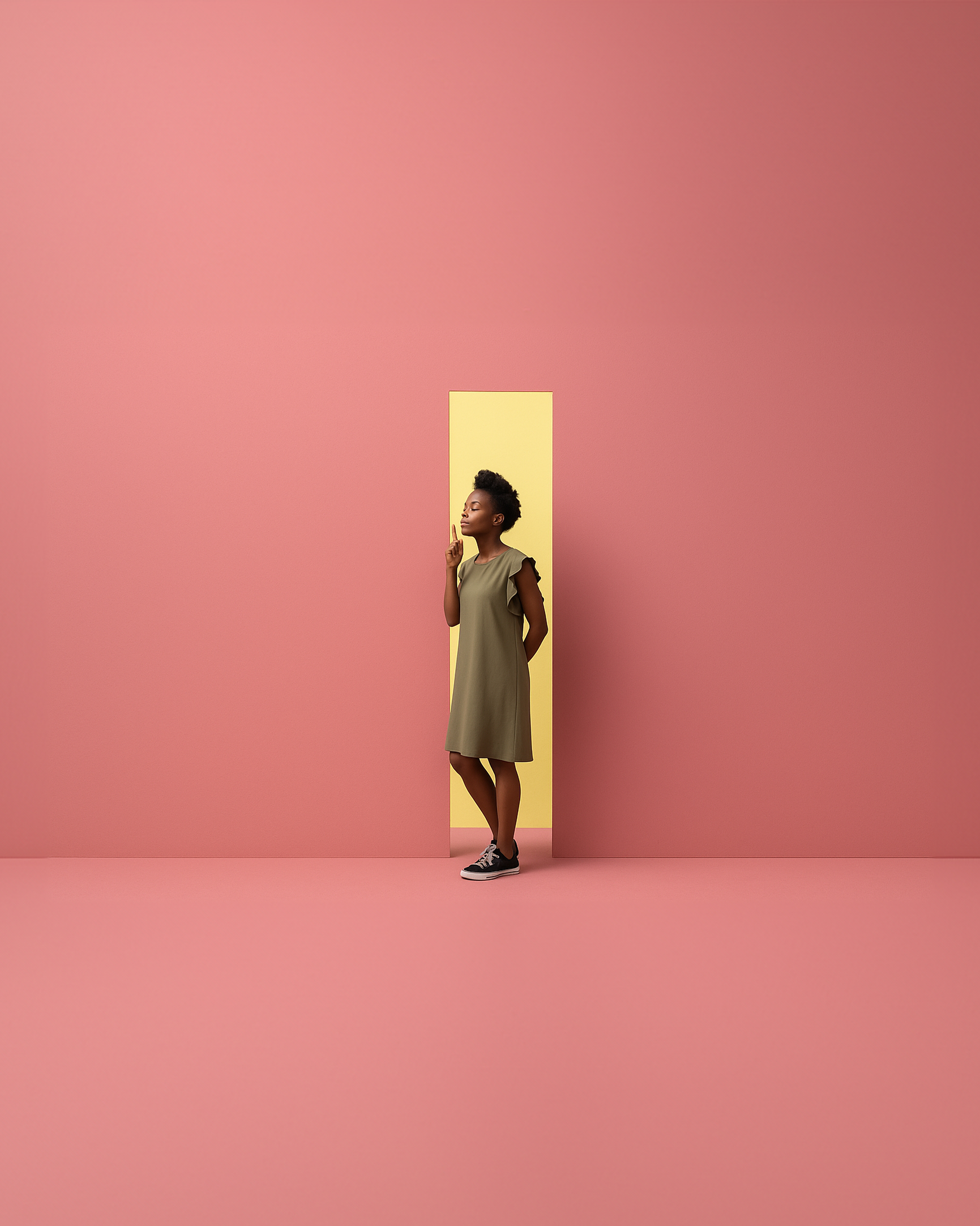
A doorway became the central metaphor. More than a physical opening, it represents possibility, choice, and the moment before a journey begins. Every colour, composition, and interaction was designed to suggest that each experience is unique, shaped by the individual rather than predefined by the system.
A doorway became the central metaphor. More than a physical opening, it represents possibility, choice, and the moment before a journey begins. Every colour, composition, and interaction was designed to suggest that each experience is unique, shaped by the individual rather than predefined by the system.

An immersive brand system
Solution
The solution was designed as a complete brand ecosystem rather than a collection of individual assets.
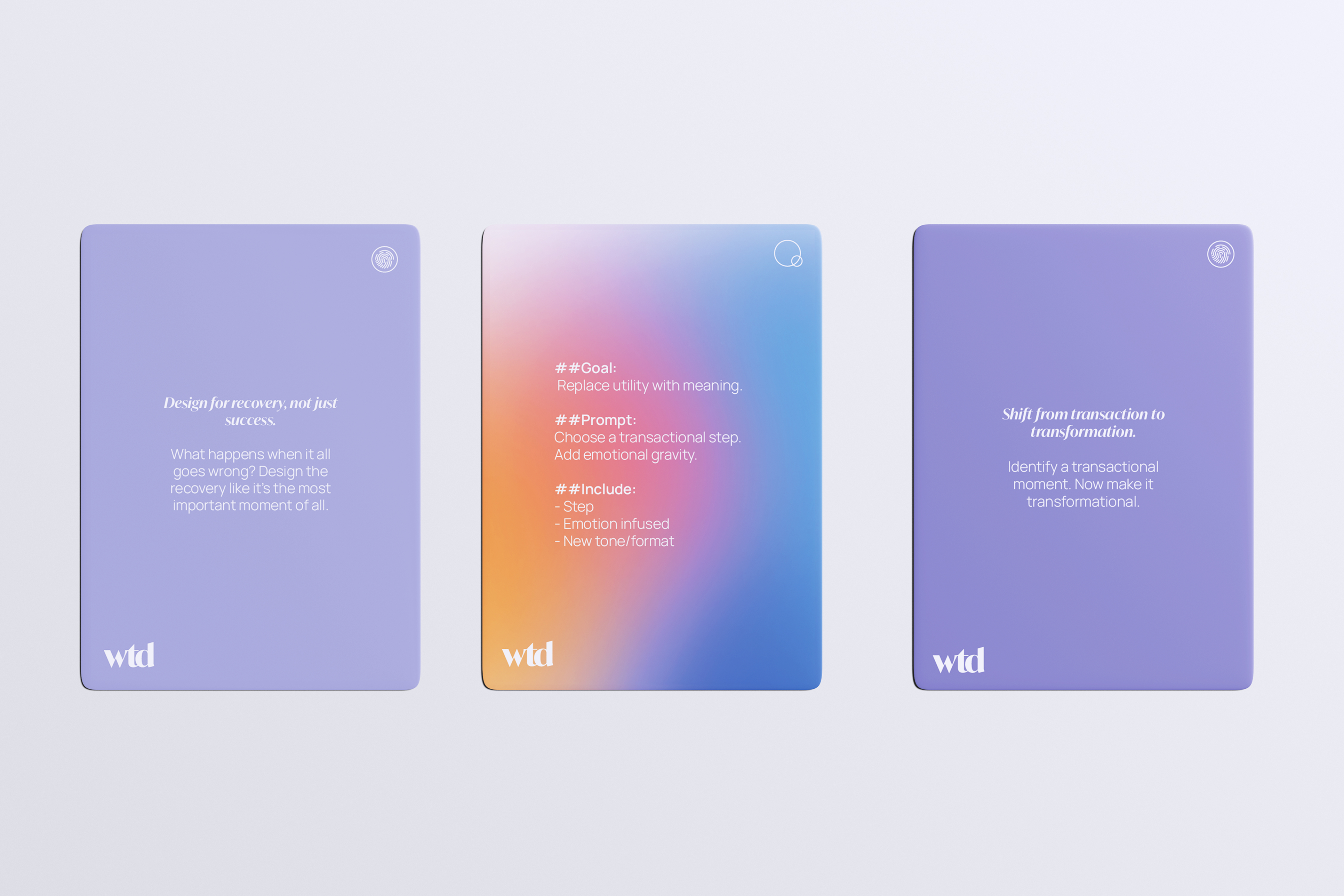
Beginning with a distinctive visual identity, I developed a scalable design language that extended across photography, digital communications, and physical environments.
A custom library of AI-generated imagery established a recognizable visual narrative, while spatial branding concepts demonstrated how the identity could shape offices, collaboration spaces, presentations, and customer-facing environments.
Every element was designed to work together, creating a cohesive brand experience regardless of where someone encountered it.
Beginning with a distinctive visual identity, I developed a scalable design language that extended across photography, digital communications, and physical environments.
A custom library of AI-generated imagery established a recognizable visual narrative, while spatial branding concepts demonstrated how the identity could shape offices, collaboration spaces, presentations, and customer-facing environments.
Every element was designed to work together, creating a cohesive brand experience regardless of where someone encountered it.

Unexclusionary: The WTD Colour theory
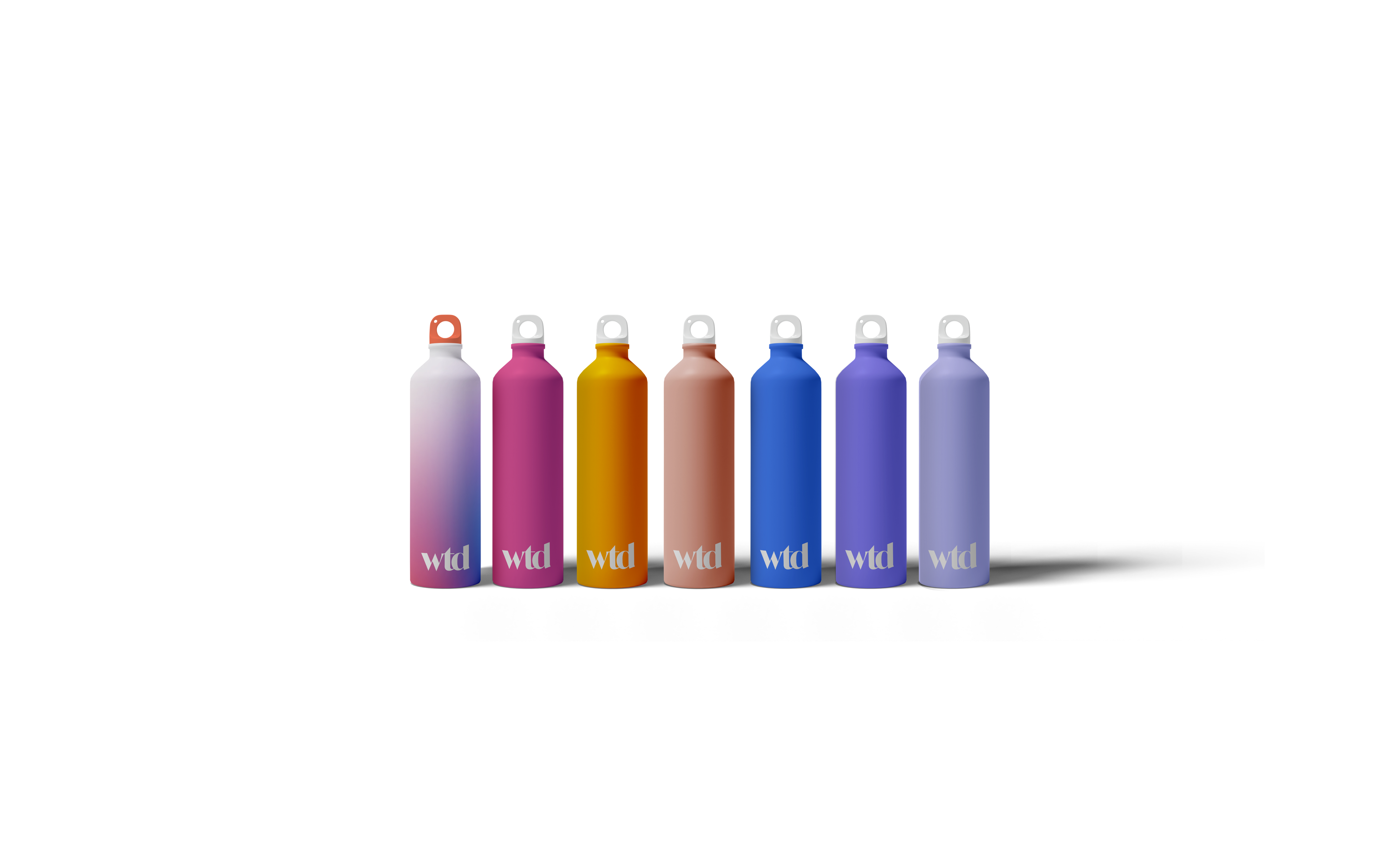
Gradient is the basis for our colour palette because it naturally brings together a wide range of complementary tones that feel both modern and emotional.
My inspiration was that individual colours could be drawn from the gradient to form a cohesive palette, with each shade standing on its own while contributing to a larger, unified colour system.
My inspiration was that individual colours could be drawn from the gradient to form a cohesive palette, with each shade standing on its own while contributing to a larger, unified colour system.


Translation of a brand into physical space
Solution
A strong brand should feel consistent regardless of where people experience it. The doorway, originally introduced as a metaphor for possibility and discovery in the digital identity, became a defining architectural element within physical spaces. Through environmental graphics, colour, and scale, the concept evolved into a tangible experience that visitors could literally move through. Rather than decorating the space with brand assets, the space itself became an extension of the brand story.


01


Contact
Email or call. I reply within two working days.